The RmarineHeatWaves package is a translation of the original Python code written by Eric C. J. Oliver that can be found on GitHub.
This package is actively maintained, but on 2018-04-24 it was forked to a new package called heatwaveR, which will supercede and eventually replace RmarineHeatWaves in the near future. For continuity, we are ensuring that the functionality in heatwaveR will be exactly the same in RmarineHeatWaves, and for a while the two packages will be maintained in sync, at least as far as developments around the existing code-base are concerned. New functions will only be added to heatwaveR.
The RmarineHeatWaves R package contains a number of functions which calculate and display marine heat waves according to the definition of Hobday et al. (2016). The marine cold spell option was implemented in version 0.13 (21 Nov 2015) of the Python module as a result of the preparation of Schlegel et al. (2017), wherein the cold events are introduced and briefly discussed.
This package may be found on CRAN. Alternatively, you can install it from GitHub by issuing the following command:
devtools::install_github("ajsmit/RmarineHeatWaves")
| Function | Description |
|---|---|
detect()
|
The main function which detects the events as per the definition of Hobday et al. (2016). |
make_whole()
|
Constructs a continuous, uninterrupted time series of temperatures. |
block_average()
|
Calculates annual means for event metrics. |
event_line()
|
Creates a line plot of marine heat waves or cold spells. |
lolli_plot()
|
Creates a timeline of selected event metrics. |
exceedance()
|
A function similar to detect() but that detects consecutive
days above/below a given threshold.
|
geom_flame()
|
Creates flame polygons of marine heat waves or cold spells. |
geom_lolli()
|
Creates a lolliplot timeline of selected event metric. |
The package also provides data of observed SST records for three historical MHWs: the 2011 Western Australia event, the 2012 Northwest Atlantic event and the 2003 Mediterranean event.
The function will return a list of two tibbles (see the ‘tidyverse’),
clim and event, which are the climatology and
MHW (or MCS) events, respectively. The climatology contains the full
time series of daily temperatures, as well as the the seasonal
climatology, the threshold and various aspects of the events that were
detected. The software was designed for detecting extreme thermal
events, and the units specified below reflect that intended purpose.
However, the various other kinds of extreme events may be detected
according to the ‘marine heat wave’ specifications, and if that is the
case, the appropriate units need to be determined by the user.
| Climatology metric | Description |
|---|---|
doy
|
Julian day (day-of-year). For non-leap years it runs 1…59 and 61…366,
while leap years run 1…366. This column will be named differently if
another name was specified to the doy argument.
|
t
|
The date of the temperature measurement. This column will be named
differently if another name was specified to the x
argument.
|
temp
|
If the software was used for the purpose for which it was designed,
seawater temperature [deg. C] on the specified date will be returned.
This column will of course be named differently if another kind of
measurement was specified to the y argument.
|
seas_clim_year
|
Climatological seasonal cycle [deg. C]. |
thresh_clim_year
|
Seasonally varying threshold (e.g., 90th percentile) [deg. C]. |
var_clim_year
|
Seasonally varying variance (standard deviation) [deg. C]. |
thresh_criterion
|
Boolean indicating if temp exceeds
thresh_clim_year.
|
duration_criterion
|
Boolean indicating whether periods of consecutive
thresh_criterion are >= min_duration.
|
event
|
Boolean indicating if all criteria that define a MHW or MCS are met. |
event_no
|
A sequential number indicating the ID and order of occurence of the MHWs or MCSs. |
The events are summarised using a range of event metrics:
| Event metric | Description |
|---|---|
index_start |
Start index of event. |
index_stop |
Stop index of event. |
event_no |
A sequential number indicating the ID and order of the events. |
duration |
Duration of event [days]. |
date_start |
Start date of event [date]. |
date_stop |
Stop date of event [date]. |
date_peak |
Date of event peak [date]. |
int_mean |
Mean intensity [deg. C]. |
int_max |
Maximum (peak) intensity [deg. C]. |
int_var |
Intensity variability (standard deviation) [deg. C]. |
int_cum |
Cumulative intensity [deg. C x days]. |
rate_onset |
Onset rate of event [deg. C / day]. |
rate_decline |
Decline rate of event [deg. C / day]. |
int_max_rel_thresh, int_mean_rel_thresh,
int_var_rel_thresh, and int_cum_rel_thresh are
as above except relative to the threshold (e.g., 90th percentile) rather
than the seasonal climatology.
int_max_abs, int_mean_abs,
int_var_abs, and int_cum_abs are as above
except as absolute magnitudes rather than relative to the seasonal
climatology or threshold.
int_max_norm and int_mean_norm are as above
except units are in multiples of threshold exceedances, i.e., a value of
1.5 indicates the event intensity (relative to the climatology) was 1.5
times the value of the threshold (relative to climatology, i.e.,
threshold - climatology.)
Note that rate_onset and rate_decline will
return NA when the event begins/ends on the first/last day
of the time series. This may be particularly evident when the function
is applied to large gridded data sets. Although the other metrics do not
contain any errors and provide sensible values, please take this into
account in its interpretation.
The detect() function is the package’s core function.
Here is the detect() function applied to the Western
Australian test data, which are also discussed by Hobday et
al. (2016):
library(RmarineHeatWaves); library(plyr); library(dplyr); library(ggplot2)
ts <- make_whole(sst_WA)
mhw <- detect(ts, climatology_start = "1983-01-01",
              climatology_end = "2012-12-31")
mhw$event %>%
  dplyr::ungroup() %>%
  dplyr::select(event_no, duration, date_start, date_peak, int_mean, int_max, int_cum) %>%
  dplyr::arrange(-int_cum) %>%
  head(5)
#> # A tibble: 5 x 7
#>   event_no duration date_start date_peak  int_mean int_max int_cum
#>      <int>    <dbl> <date>     <date>        <dbl>   <dbl>   <dbl>
#> 1       22      95. 1999-05-13 1999-05-22     2.50    3.60   237.
#> 2       42      60. 2011-02-06 2011-02-28     3.21    6.51   193.
#> 3       49      47. 2012-01-11 2012-01-27     2.23    3.30   105.
#> 4       50      46. 2012-03-01 2012-04-10     1.99    2.96    91.7
#> 5       41      40. 2010-12-24 2011-01-28     2.16    3.27    86.3
The corresponding event_line() and
lolli_plot(), which represent the massive Western
Australian heatwave of 2011, look like this:
event_line(mhw, spread = 200, metric = "int_cum",
           start_date = "2010-10-01", end_date = "2011-08-30")
lolli_plot(mhw)
The event_line() and lolli_plot() functions
were designed to work directly on one of the list returned by
detect(). If more control over the figures is required, it
may be useful to create them in ggplot2 by stacking
‘geoms’. We specifically created two new ggplot2 geoms
to reproduce the functionality of event_line() and
lolli_plot(). These functions are more general in their
functionality and can be used outside of the
RmarineHeatWave package too. To apply them to MHWs and
MCSs, they require that we access the clim or
event data frames within the list that is produced by
detect(). Here is how:
mhw2 <- mhw$clim # find the climatology dataframe
mhw2 <- mhw2[10580:10690,] # identify the region of the time series of interest

ggplot(mhw2, aes(x = t, y = temp, y2 = thresh_clim_year)) +
  geom_flame() +
  geom_text(aes(x = as.Date("2011-02-01"), y = 28, label = "The MHW that launched\na thousand papers."))

ggplot(mhw$event, aes(x = date_start, y = int_max)) +
  geom_lolli(colour = "salmon", colour.n = "red", n = 3) +
  geom_text(aes(x = as.Date("2006-10-01"), y = 5,
                label = "The distribution of events\nis skewed towards the\nend of the time series."),
            colour = "black")
The default output of these function may not be to your liking. If so, not to worry. As ggplot2 geoms, they are highly maleable. For example, if we were to choose to reproduce the format of the MHWs as seen in Hobday et al. (2016), the code would look something like this:
# It is necessary to give geom_flame() at least one row on either side of the event in order to calculate the polygon corners smoothly
mhw_top <- mhw2[49:110,]

ggplot(data = mhw2, aes(x = t)) +
  geom_flame(aes(y = temp, y2 = thresh_clim_year, fill = "all"), show.legend = T) +
  geom_flame(data = mhw_top, aes(y = temp, y2 = thresh_clim_year, fill = "top"), show.legend = T) +
  geom_line(aes(y = temp, colour = "temp")) +
  geom_line(aes(y = thresh_clim_year, colour = "thresh"), size = 1.0) +
  geom_line(aes(y = seas_clim_year, colour = "seas"), size = 1.2) +
  scale_colour_manual(name = "Line Colour",
                      values = c("temp" = "black", "thresh" =  "forestgreen", "seas" = "grey80")) +
  scale_fill_manual(name = "Event Colour", values = c("all" = "salmon", "top" = "red")) +
  guides(colour = guide_legend(override.aes = list(fill = NA))) +
  xlab("Date") +
  ylab(expression(paste("Temperature [", degree, "C]")))
Conversely, should we not wish to highlight any events with
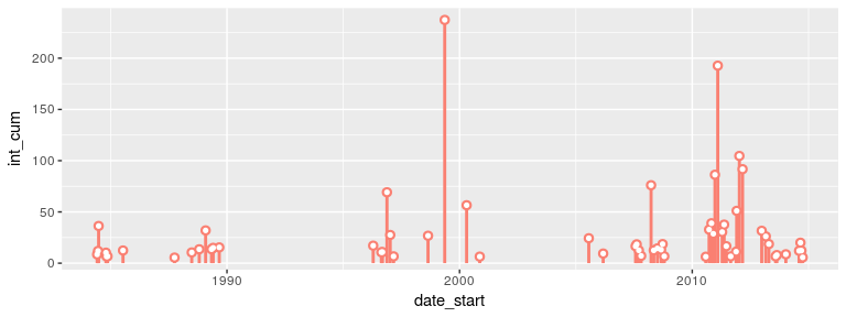
geom_lolli(), it would look like this:
# Note that this is accomplished by setting 'colour.n = NA', not by setting 'n = 0'.
ggplot(mhw$event, aes(x = date_start, y = int_cum)) +
  geom_lolli(colour = "salmon", n = 3, colour.n = NA)
The calculation and visualisation of marine cold spells is also accommodated within this package. Here is a cold spell detected in the OISST data for Western Australia:
mcs <- detect(ts, climatology_start = "1983-01-01", climatology_end = "2012-12-31",
              cold_spells = TRUE)
mcs$event %>%
  dplyr::ungroup() %>%
  dplyr::select(event_no, duration, date_start, date_peak, int_mean, int_max, int_cum) %>%
  dplyr::arrange(int_cum) %>%
  head(5)
#> # A tibble: 5 x 7
#>   event_no duration date_start date_peak  int_mean int_max int_cum
#>      <int>    <dbl> <date>     <date>        <dbl>   <dbl>   <dbl>
#> 1       16      76. 1990-04-13 1990-05-11    -2.54   -3.22  -193.
#> 2       54      58. 2003-12-19 2004-01-23    -1.80   -2.66  -104.
#> 3       71      52. 2014-04-14 2014-05-05    -1.82   -2.57   -94.6
#> 4        8      38. 1986-06-24 1986-07-17    -2.01   -2.95   -76.4
#> 5       51      32. 2003-09-08 2003-09-16    -1.56   -2.12   -49.9
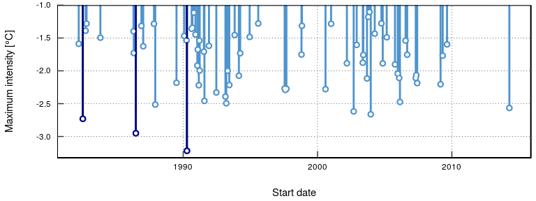
The plots showing the marine cold spells look like this:
# this function needs to be updated as it currently only works when 't' is the column name for date
event_line(mcs, spread = 200, metric = "int_cum",
           start_date = "1990-01-01", end_date = "1990-08-30")

lolli_plot(mcs)

Cold spell figures may be created as geoms in ggplot2, too:
mcs2 <- mcs$clim
mcs2 <- mcs2[2990:3190,]

# # Note that the plot centres on the polygons, so it may be necessary to manually zoom out a bit
ggplot(data = mcs2, aes(x = t)) +
  geom_flame(aes(y = thresh_clim_year, y2 = temp), fill = "steelblue3", show.legend = F) +
  geom_line(aes(y = temp, colour = "temp")) +
  geom_line(aes(y = thresh_clim_year, colour = "thresh"), size = 1.0) +
  geom_line(aes(y = seas_clim_year, colour = "seas"), size = 1.2) +
  scale_colour_manual(name = "Line Colour",
                      values = c("temp" = "black", "thresh" =  "forestgreen", "seas" = "grey80")) +
  scale_y_continuous(limits = c(18, 23.5)) +
  xlab("Date") +
  ylab(expression(paste("Temperature [", degree, "C]")))

ggplot(mcs$event, aes(x = date_start, y = int_cum)) +
  geom_lolli(colour = "steelblue3", colour.n = "navy", n = 7) +
  xlab("Date") +
  ylab(expression(paste("Cumulative intensity [days x ", degree, "C]")))

In addition to the calculation of extreme events, consecutive days
over a given static threshold may be calculated with the
exceedance() function.
exc <- exceedance(ts, threshold = 25)
exc$exceedance %>%
  ungroup() %>%
  select(exceedance_no, duration, date_start, date_peak, int_mean, int_cum) %>%
  dplyr::arrange(-int_cum) %>%
  head(5)
#>   exceedance_no duration date_start  date_peak  int_mean   int_cum
#> 1             7       52 2011-02-08 2011-02-28 1.6740379 87.049969
#> 2             6       25 2008-04-03 2008-04-14 0.9799994 24.499985
#> 3            10       41 2012-03-03 2012-04-10 0.4385360 17.979977
#> 4             2       17 1999-05-13 1999-05-22 0.8558818 14.549990
#> 5             5       10 2000-05-03 2000-05-04 0.6969994  6.969994
The same function may be used to calculate consecutive days below a threshold, too.
exc <- exceedance(ts, threshold = 19, below = TRUE)
exc$exceedance %>%
  dplyr::ungroup() %>%
  dplyr::select(exceedance_no, duration, date_start, date_peak, int_mean, int_cum) %>%
  dplyr::arrange(int_cum) %>%
  head(5)
#>   exceedance_no duration date_start  date_peak   int_mean   int_cum
#> 1            17       46 2003-09-06 2003-09-16 -0.6008700 -27.64002
#> 2            16       31 2002-09-08 2002-09-25 -0.8480649 -26.29001
#> 3            13       24 1997-09-03 1997-09-15 -0.7691671 -18.46001
#> 4            20       25 2005-09-26 2005-10-12 -0.5420004 -13.55001
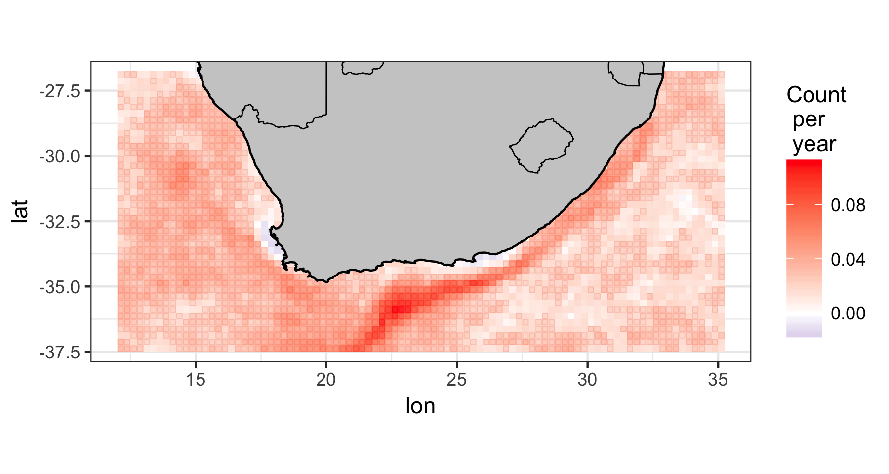
#> 5 12 18 1997-08-13 1997-08-22 -0.6944449 -12.50001We can also load the gridded 0.25 degree Reynolds OISST
data and apply the function pixel by pixel over all of the days of
data. The example data used here have 93 longitude steps, 43 latitude
steps, and cover 12797 days (1981 to 2016). We apply the
detect() function to these data, fit a generalised linear
model (GLM), and then plot the trend per decade of the marine heatwave
count. In other words, have marine heatwaves become more or less
frequent in recent years? Under climate change we can expect that
extreme events would tend to occur more frequently and be of greater
intensity. Indeed, we can clearly see in the figure below of the result
of the GLM, how the Agulhas Current has been experiencing marine heat
waves more frequently in recent decades. But there are two smaller
areas, one along the western side of the Cape Peninsula in the Benguela
Upwelling system and another around the Eastern Cape Province near Algoa
Bay, where the frequency of marine heat waves seems to have actually
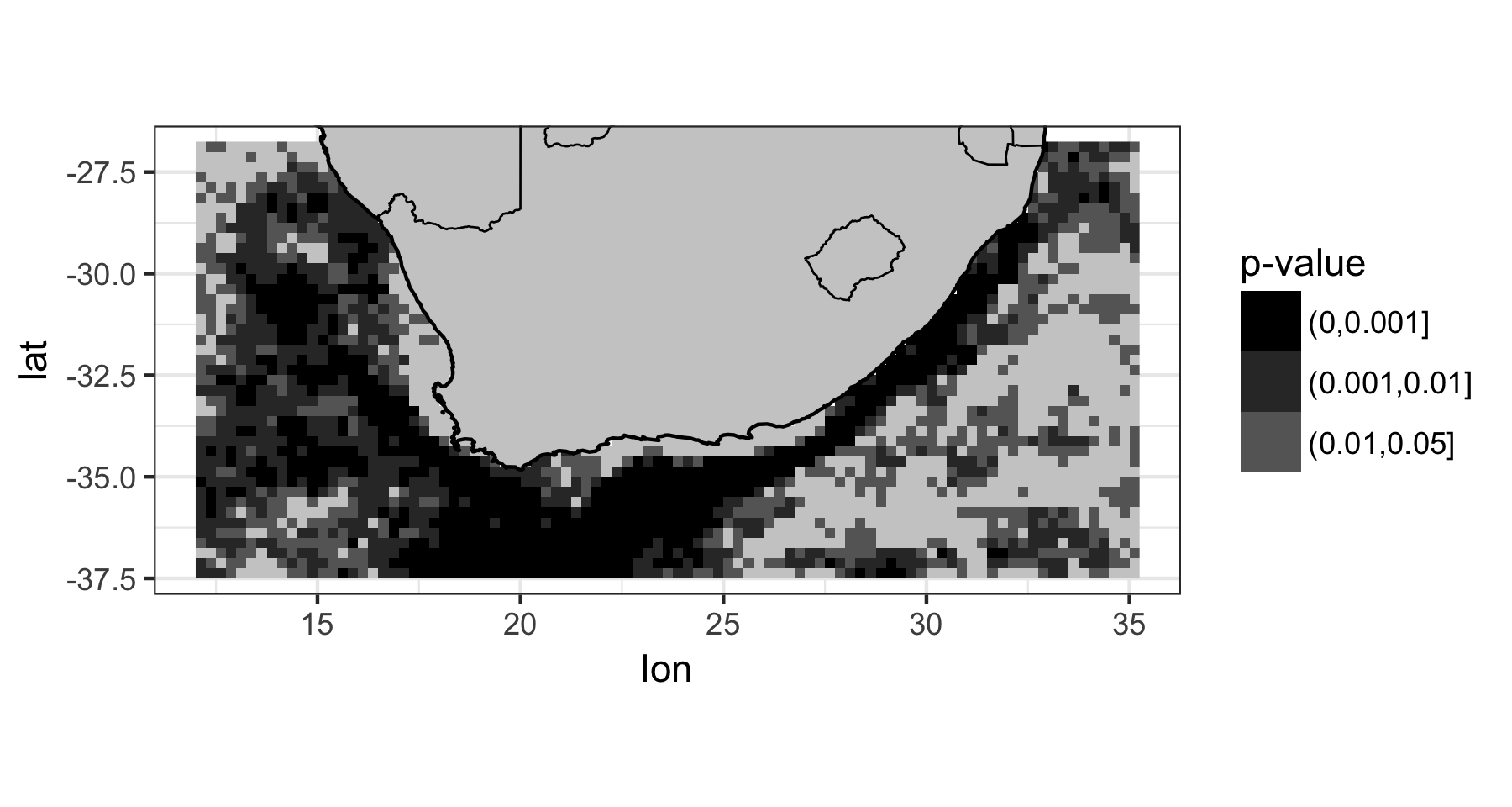
been decreasing – although the P-value of the decreasing trend
is > 0.05, and therefore not significant.


Please read the package vignette to see how to load a netCDF file with the OISST data, apply the RmarineHeatWaves function to the whole 3D array of data, and then fit the GLM and plot the data.
Hobday, A.J. et al. (2016). A hierarchical approach to defining marine heatwaves, Progress in Oceanography, 141, pp. 227-238.
Schlegel, R. W., Oliver, E. C. J., Wernberg, T. W., Smit, A. J. (2017). Coastal and offshore co-occurrences of marine heatwaves and cold-spells. Progress in Oceanography, 151, pp. 189-205.
Schlegel, R. W., Oliver, E. C., Perkins-Kirkpatrick, S., Kruger, A., Smit, A. J. (2017). Predominant atmospheric and oceanic patterns during coastal marine heatwaves. Frontiers in Marine Science, 4, 323.
The Python code was written by Eric C. J. Oliver.
Contributors to the Marine Heatwaves definition and its numerical implementation include Alistair J. Hobday, Lisa V. Alexander, Sarah E. Perkins, Dan A. Smale, Sandra C. Straub, Jessica Benthuysen, Michael T. Burrows, Markus G. Donat, Ming Feng, Neil J. Holbrook, Pippa J. Moore, Hillary A. Scannell, Alex Sen Gupta, and Thomas Wernberg.
The translation from Python to R was done by A. J. Smit and the graphing functions were contributed to by Robert. W. Schlegel.
A. J. Smit Department for Biodiversity & Conservation Biology, University of the Western Cape, Private Bag X17, Bellville 7535, South Africa, E-mail: ajsmit@uwc.ac.za, Work tel.: +27 (0)21 959 3783