v.scatterplot
Plots the values of two columns in the attribute table of an input vector layer in a scatterplot.
v.scatterplot [-reg] map=name x=name y=name [type=string] [output=name] [plot_dimensions=string] [dpi=integer] [title=string] [fontsize=float] [style=string] [x_label=string] [y_label=string] [marker=string] [s=float] [color=name] [rgbcolumn=name] [bins=string] [density_colormap=string] [trendline=string] [degree=integer] [line_color=name] [line_style=string] [line_width=float] [n=string] [ellipse_color=name] [ellipse_alpha=float] [ellipse_edge_style=string] [ellipse_edge_width=float] [groups=name] [groups_rgb=name] [ellipse_legend=string] [quadrants=string] [quandrant_linecolor=name] [quandrant_linewidth=float] [x_axis_limits=string] [y_axis_limits=string] [--overwrite] [--verbose] [--quiet] [--qq] [--ui]
Example:
v.scatterplot map=name x=name y=name
grass.tools.Tools.v_scatterplot(map, x, y, type="scatter", output=None, plot_dimensions="6.4,4.8", dpi=100, title=None, fontsize=None, style=None, x_label=None, y_label=None, marker="o", s=None, color="", rgbcolumn=None, bins="30,30", density_colormap="viridis", trendline=None, degree=1, line_color="", line_style="--", line_width=None, n="2", ellipse_color="red", ellipse_alpha=0.1, ellipse_edge_style="-", ellipse_edge_width=1.5, groups=None, groups_rgb=None, ellipse_legend="yes", quadrants=None, quandrant_linecolor="", quandrant_linewidth=None, x_axis_limits=None, y_axis_limits=None, flags=None, overwrite=None, verbose=None, quiet=None, superquiet=None)
Example:
tools = Tools()
tools.v_scatterplot(map="name", x="name", y="name")
This grass.tools API is experimental in version 8.5 and expected to be stable in version 8.6.
grass.script.run_command("v.scatterplot", map, x, y, type="scatter", output=None, plot_dimensions="6.4,4.8", dpi=100, title=None, fontsize=None, style=None, x_label=None, y_label=None, marker="o", s=None, color="", rgbcolumn=None, bins="30,30", density_colormap="viridis", trendline=None, degree=1, line_color="", line_style="--", line_width=None, n="2", ellipse_color="red", ellipse_alpha=0.1, ellipse_edge_style="-", ellipse_edge_width=1.5, groups=None, groups_rgb=None, ellipse_legend="yes", quadrants=None, quandrant_linecolor="", quandrant_linewidth=None, x_axis_limits=None, y_axis_limits=None, flags=None, overwrite=None, verbose=None, quiet=None, superquiet=None)
Example:
gs.run_command("v.scatterplot", map="name", x="name", y="name")
Parameters
map=name [required]
Input map
input vector layer
x=name [required]
Name of x column
Name of the column with x values
y=name [required]
Name of y column
Name of the column with y values
type=string
Plot type
Type of plot (scatter, density)
Allowed values: scatter, density
Default: scatter
output=name
Name of the output file (extension decides format)
Name of the output file. The format is determined by the file extension.
plot_dimensions=string
Plot dimensions (width,height)
Dimensions (width,height) of the figure in inches
Default: 6.4,4.8
dpi=integer
DPI
Resolution of plot in dpi's
Default: 100
title=string
Plot title
The title of the plot
fontsize=float
Font size
The basis font size. Defaults to the Matplotlib/style default.
style=string
Matplotlib style
Matplotlib style sheet, see https://matplotlib.org/stable/gallery/style_sheets/style_sheets_reference.html
x_label=string
x-axis label
Label for the x-axis. If left empty, the name of the x column is used.
y_label=string
y-axis label
Label for the y-axis. If left empty, the name of the y column is used.
marker=string
Dot marker
Set dot marker (see https://matplotlib.org/stable/api/markers_api.html for options)
Default: o
s=float
Marker size
Set marker size
color=name
Dot color
Color of dots. Defaults to the Matplotlib/style default.
rgbcolumn=name
RGB column
Column with RGB values defining the colors of the dots of the scatterplot
bins=string
2D bins
The number of bins in x and y dimension. Density is expressed as the number of points falling within the x and y boundaries of a bin.
Default: 30,30
density_colormap=string
Density plot color map
Select the color map to be used for the density scatter plot
Allowed values: viridis, plasma, inferno, magma, cividis, Greys, Purples, Blues, Greens, Oranges, Reds, YlOrBr, YlOrRd, OrRd, PuRd, RdPu, BuPu, GnBu, PuBu, YlGnBu, PuBuGn, BuGn, YlGn
Default: viridis
trendline=string
Trendline
Plot trendline
Allowed values: linear, polynomial
degree=integer
Degree
Degree polynomial trendline
Default: 1
line_color=name
Color trendline
Color of the trendline. Defaults to the Matplotlib/style default.
line_style=string
Line style trendline
Line style trendline
Default: --
line_width=float
trendline width
Line width of the trendline. Defaults to the Matplotlib default.
n=string
standard deviations
Draw the covariance confidence ellipse(s) with radius of n standard deviations.
Default: 2
ellipse_color=name
Ellipse color
Color of the ellipse
Default: red
ellipse_alpha=float
Opacity ellipse fill.
Opacity of the fill color of the ellipse.
Allowed values: 0-1
Default: 0.1
ellipse_edge_style=string
Ellipse edge style
Line style of the ellipse
Default: -
ellipse_edge_width=float
Ellipse edge width
Width of the ellipse edge
Default: 1.5
groups=name
Column grouping the features in categories
Column with categories. If selected, a separate ellipse will be drawn for each group/category
groups_rgb=name
RGB column for ellipse categories
Column with RGB values per category. These will be used to define the color of the ellipse.
ellipse_legend=string
legend for ellipses
Print the legend for the ellipses (only for if ellipses for groups are drawn)
Allowed values: yes, no
Default: yes
quadrants=string
quadrants
Print the mean or median on x and y-axis
Allowed values: mean, median
quandrant_linecolor=name
Line color
Color of the lines making up the quadrants. Defaults to the Matplotlib default.
quandrant_linewidth=float
quandrant line width
Line width of the lines dividing the points in four quadrants. Defaults to the Matplotlib default.
x_axis_limits=string
X axis range (min,max)
Set the X axis range to be displayed
y_axis_limits=string
Y axis range (min,max)
Set the Y axis range to be displayed
-r
Reverse color map
-e
Draw a covariance confidence ellipse(s)
-g
Add grid lines
Add grid lines
--overwrite
Allow output files to overwrite existing files
--help
Print usage summary
--verbose
Verbose module output
--quiet
Quiet module output
--qq
Very quiet module output
--ui
Force launching GUI dialog
map : str, required
Input map
input vector layer
Used as: input, vector, name
x : str, required
Name of x column
Name of the column with x values
Used as: input, dbcolumn, name
y : str, required
Name of y column
Name of the column with y values
Used as: input, dbcolumn, name
type : str, optional
Plot type
Type of plot (scatter, density)
Allowed values: scatter, density
Default: scatter
output : str, optional
Name of the output file (extension decides format)
Name of the output file. The format is determined by the file extension.
Used as: output, file, name
plot_dimensions : str, optional
Plot dimensions (width,height)
Dimensions (width,height) of the figure in inches
Default: 6.4,4.8
dpi : int, optional
DPI
Resolution of plot in dpi's
Default: 100
title : str, optional
Plot title
The title of the plot
fontsize : float, optional
Font size
The basis font size. Defaults to the Matplotlib/style default.
style : str, optional
Matplotlib style
Matplotlib style sheet, see https://matplotlib.org/stable/gallery/style_sheets/style_sheets_reference.html
x_label : str, optional
x-axis label
Label for the x-axis. If left empty, the name of the x column is used.
y_label : str, optional
y-axis label
Label for the y-axis. If left empty, the name of the y column is used.
marker : str, optional
Dot marker
Set dot marker (see https://matplotlib.org/stable/api/markers_api.html for options)
Default: o
s : float, optional
Marker size
Set marker size
color : str, optional
Dot color
Color of dots. Defaults to the Matplotlib/style default.
Used as: input, color, name
rgbcolumn : str, optional
RGB column
Column with RGB values defining the colors of the dots of the scatterplot
Used as: input, dbcolumn, name
bins : str, optional
2D bins
The number of bins in x and y dimension. Density is expressed as the number of points falling within the x and y boundaries of a bin.
Default: 30,30
density_colormap : str, optional
Density plot color map
Select the color map to be used for the density scatter plot
Allowed values: viridis, plasma, inferno, magma, cividis, Greys, Purples, Blues, Greens, Oranges, Reds, YlOrBr, YlOrRd, OrRd, PuRd, RdPu, BuPu, GnBu, PuBu, YlGnBu, PuBuGn, BuGn, YlGn
Default: viridis
trendline : str, optional
Trendline
Plot trendline
Allowed values: linear, polynomial
degree : int, optional
Degree
Degree polynomial trendline
Default: 1
line_color : str, optional
Color trendline
Color of the trendline. Defaults to the Matplotlib/style default.
Used as: input, color, name
line_style : str, optional
Line style trendline
Line style trendline
Default: --
line_width : float, optional
trendline width
Line width of the trendline. Defaults to the Matplotlib default.
n : str, optional
standard deviations
Draw the covariance confidence ellipse(s) with radius of n standard deviations.
Default: 2
ellipse_color : str, optional
Ellipse color
Color of the ellipse
Used as: input, color, name
Default: red
ellipse_alpha : float, optional
Opacity ellipse fill.
Opacity of the fill color of the ellipse.
Allowed values: 0-1
Default: 0.1
ellipse_edge_style : str, optional
Ellipse edge style
Line style of the ellipse
Default: -
ellipse_edge_width : float, optional
Ellipse edge width
Width of the ellipse edge
Default: 1.5
groups : str, optional
Column grouping the features in categories
Column with categories. If selected, a separate ellipse will be drawn for each group/category
Used as: input, dbcolumn, name
groups_rgb : str, optional
RGB column for ellipse categories
Column with RGB values per category. These will be used to define the color of the ellipse.
Used as: input, dbcolumn, name
ellipse_legend : str, optional
legend for ellipses
Print the legend for the ellipses (only for if ellipses for groups are drawn)
Allowed values: yes, no
Default: yes
quadrants : str, optional
quadrants
Print the mean or median on x and y-axis
Allowed values: mean, median
quandrant_linecolor : str, optional
Line color
Color of the lines making up the quadrants. Defaults to the Matplotlib default.
Used as: input, color, name
quandrant_linewidth : float, optional
quandrant line width
Line width of the lines dividing the points in four quadrants. Defaults to the Matplotlib default.
x_axis_limits : str, optional
X axis range (min,max)
Set the X axis range to be displayed
y_axis_limits : str, optional
Y axis range (min,max)
Set the Y axis range to be displayed
flags : str, optional
Allowed values: r, e, g
r
Reverse color map
e
Draw a covariance confidence ellipse(s)
g
Add grid lines
Add grid lines
overwrite : bool, optional
Allow output files to overwrite existing files
Default: None
verbose : bool, optional
Verbose module output
Default: None
quiet : bool, optional
Quiet module output
Default: None
superquiet : bool, optional
Very quiet module output
Default: None
Returns:
result : grass.tools.support.ToolResult | None
If the tool produces text as standard output, a ToolResult object will be returned. Otherwise, None will be returned.
Raises:
grass.tools.ToolError: When the tool ended with an error.
map : str, required
Input map
input vector layer
Used as: input, vector, name
x : str, required
Name of x column
Name of the column with x values
Used as: input, dbcolumn, name
y : str, required
Name of y column
Name of the column with y values
Used as: input, dbcolumn, name
type : str, optional
Plot type
Type of plot (scatter, density)
Allowed values: scatter, density
Default: scatter
output : str, optional
Name of the output file (extension decides format)
Name of the output file. The format is determined by the file extension.
Used as: output, file, name
plot_dimensions : str, optional
Plot dimensions (width,height)
Dimensions (width,height) of the figure in inches
Default: 6.4,4.8
dpi : int, optional
DPI
Resolution of plot in dpi's
Default: 100
title : str, optional
Plot title
The title of the plot
fontsize : float, optional
Font size
The basis font size. Defaults to the Matplotlib/style default.
style : str, optional
Matplotlib style
Matplotlib style sheet, see https://matplotlib.org/stable/gallery/style_sheets/style_sheets_reference.html
x_label : str, optional
x-axis label
Label for the x-axis. If left empty, the name of the x column is used.
y_label : str, optional
y-axis label
Label for the y-axis. If left empty, the name of the y column is used.
marker : str, optional
Dot marker
Set dot marker (see https://matplotlib.org/stable/api/markers_api.html for options)
Default: o
s : float, optional
Marker size
Set marker size
color : str, optional
Dot color
Color of dots. Defaults to the Matplotlib/style default.
Used as: input, color, name
rgbcolumn : str, optional
RGB column
Column with RGB values defining the colors of the dots of the scatterplot
Used as: input, dbcolumn, name
bins : str, optional
2D bins
The number of bins in x and y dimension. Density is expressed as the number of points falling within the x and y boundaries of a bin.
Default: 30,30
density_colormap : str, optional
Density plot color map
Select the color map to be used for the density scatter plot
Allowed values: viridis, plasma, inferno, magma, cividis, Greys, Purples, Blues, Greens, Oranges, Reds, YlOrBr, YlOrRd, OrRd, PuRd, RdPu, BuPu, GnBu, PuBu, YlGnBu, PuBuGn, BuGn, YlGn
Default: viridis
trendline : str, optional
Trendline
Plot trendline
Allowed values: linear, polynomial
degree : int, optional
Degree
Degree polynomial trendline
Default: 1
line_color : str, optional
Color trendline
Color of the trendline. Defaults to the Matplotlib/style default.
Used as: input, color, name
line_style : str, optional
Line style trendline
Line style trendline
Default: --
line_width : float, optional
trendline width
Line width of the trendline. Defaults to the Matplotlib default.
n : str, optional
standard deviations
Draw the covariance confidence ellipse(s) with radius of n standard deviations.
Default: 2
ellipse_color : str, optional
Ellipse color
Color of the ellipse
Used as: input, color, name
Default: red
ellipse_alpha : float, optional
Opacity ellipse fill.
Opacity of the fill color of the ellipse.
Allowed values: 0-1
Default: 0.1
ellipse_edge_style : str, optional
Ellipse edge style
Line style of the ellipse
Default: -
ellipse_edge_width : float, optional
Ellipse edge width
Width of the ellipse edge
Default: 1.5
groups : str, optional
Column grouping the features in categories
Column with categories. If selected, a separate ellipse will be drawn for each group/category
Used as: input, dbcolumn, name
groups_rgb : str, optional
RGB column for ellipse categories
Column with RGB values per category. These will be used to define the color of the ellipse.
Used as: input, dbcolumn, name
ellipse_legend : str, optional
legend for ellipses
Print the legend for the ellipses (only for if ellipses for groups are drawn)
Allowed values: yes, no
Default: yes
quadrants : str, optional
quadrants
Print the mean or median on x and y-axis
Allowed values: mean, median
quandrant_linecolor : str, optional
Line color
Color of the lines making up the quadrants. Defaults to the Matplotlib default.
Used as: input, color, name
quandrant_linewidth : float, optional
quandrant line width
Line width of the lines dividing the points in four quadrants. Defaults to the Matplotlib default.
x_axis_limits : str, optional
X axis range (min,max)
Set the X axis range to be displayed
y_axis_limits : str, optional
Y axis range (min,max)
Set the Y axis range to be displayed
flags : str, optional
Allowed values: r, e, g
r
Reverse color map
e
Draw a covariance confidence ellipse(s)
g
Add grid lines
Add grid lines
overwrite : bool, optional
Allow output files to overwrite existing files
Default: None
verbose : bool, optional
Verbose module output
Default: None
quiet : bool, optional
Quiet module output
Default: None
superquiet : bool, optional
Very quiet module output
Default: None
DESCRIPTION
v.scatterplot draws a scatterplot of the value in one column against the values in another column. There are a few layout options, including the option to set the color of the dots, the color, line type, and width of the trend line, and the font size of the axis and tic labels.
Instead of a fixed color, dots can be colored using colors from a user-defined
column, or by the spatial density of nearby points, using the option
type=density. The spatial density is computed by grouping the points in 2D
bins. The number of bins along the x-axis and y-axis is user-defined. The user
can select a color map from a list of sequential colormaps and perceptually
uniform sequential colormaps. See the matplotlib manual
page for
details. Use the -r flag to reverse the order of the colors.
By default, the resulting plot is displayed on screen. However, the user can
also save the plot to a file using the file_name option. The format is
determined by the extension given by the user. So, if
file_name = outputfile.png, the plot will be saved as a PNG file.
The style option applies a Matplotlib style sheet to the plot, e.g. style=ggplot.
A linear or polynomial trend line with user-defined degrees can be drawn on top of the scatter/density plot. If this option is enables, the R2 and trend line equation are printed to the commmand line.
A confidence ellipse of the covariance of the two variables can be plotted on top of the scatterplot, following the method described in Plot Confidence Ellipse 001, and using the code described in the Matplotlib example confidence_ellipse. The radius of the ellipse can be controlled by n which is the number of standard deviations (SD). The default is 2 SD, which results in an ellipse that encloses around 95% of the points. Optionally, separate confidence ellipses can be drawn for groups defined in the column groups. Groups can be assigned a random color, or a color based on the RGB colors in a user-defined column. Note, all records in the group should have the same color.
The user has the option to limit/expand the X-axis (x_axis_limits) and Y-axis (y_axis_limits). This can e.g., make it easier to compare different plots.
EXAMPLES
Example 1
For the examples below, the NCA sample data set from GRASS GIS website will be used
Create a new mapset and Use the layer lsat7_2002_10@PERMANENT to set the region.
g.mapset -c mapset=scatterplot
g.region raster=lsat7_2002_10@PERMANENT
Get the list of Landsat layers from the Permanent mapset. Use this as input for i.pca to create principal component layers.
lcc=`g.list type="raster" mapset="PERMANENT" pattern="lsat7_*" sep=,`
i.pca -n input=$lcc output=pca rescale=0,100
Create 5000 random points, retrieve the raster value from the first two PCA layers for each point location of the random points, and write these values to the columns pca_1 and pca_2 in the attribute table of randompoints.
r.random input=elevation npoints=5000 vector=randompoints seed=10
v.what.rast map=randompoints raster=pca.1 column=pca_1
v.what.rast map=randompoints raster=pca.2 column=pca_2
Create a scatterplot, plotting the values from the column pca_1 on the X-axis and pca_2 on the Y-asix, with blue dots.
v.scatterplot map=randompoints x=pca_1 y=pca_2 color=blue
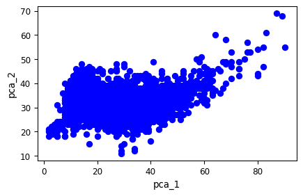 Figure 1. Scatterplot of pca_1 against pca_2.
Example 2
Create a density scatter of the values from pca_1 and pca_2. Add a red dashed polynomial trend line with degree 2.
v.scatterplot map=randompoints x=pca_1 y=pca_2 trendline=polynomial \
degree=2 line_color=red type=density bins=10,10
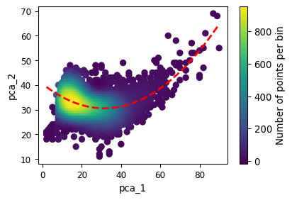 Figure 2. Density scatterplot of pca_1 against pca_2. The dashed red line
gives the polynomial trend line (R²=0.149)
Figure 2. Density scatterplot of pca_1 against pca_2. The dashed red line
gives the polynomial trend line (R²=0.149)
Example 3
Retrieves raster value from the raster layer landclass96, and write these values to the column landuse in the attribute table of randompoints. Next, transfer the raster colors of the raster layer landclass96 to the new column RGB of the attribute table of randompoints.
v.what.rast map=randompoints raster=landclass96 column=landuse
v.colors map=randompoints use=attr column=landuse \
raster=landclass96@PERMANENT rgb_column=RGB
Create a scatterplot, using the colors from the RGB column. Set the size of the dots to 8.
v.scatterplot map=randompoints x=pca_1 y=pca_2 s=8 rgbcolumn=RGB
 Figure 3. Scatterplot of pca_1 against pca_1. Colors represent the land use
categories in the point locations based on the landclass96 map.
Figure 3. Scatterplot of pca_1 against pca_1. Colors represent the land use
categories in the point locations based on the landclass96 map.
Example 4
Rename the PCA layers to remove the dots from the name. Next, use the v.what.rast.label addon to sample the values of the raster layers pca.1 and pca.2, and the values + labels of the landclass96. Add a column with the landclass colors using v.colors.
g.rename raster=pca.1,pca_1
g.rename raster=pca.2,pca_2
v.what.rast.label vector=randompoints raster=landclass96 \
raster2=pca_1,pca_2 output=randompoints2
v.colors map=randompoints2 use=attr column=landclass96_ID \
raster=landclass96 rgb_column=RGB
Extract the points with the categories forest (5), water (6) and developed (1). Create a scatterplot of pca_1 against pca_2 and add the 2 SD confidence ellipse of the covariance of the two variables for each of the land use categories, coloring both the dots and ellipses using the landclass colors.
v.extract input=randompoints2 \
where='landclass96_ID=1 OR landclass96_ID=5 OR landclass96_ID=6' \
output=forwatdev
v.scatterplot -e map=forwatdev x=pca_1 y=pca_2 rgbcolumn=RGB s=5  \
groups=landclass96 groups_rgb=RGB
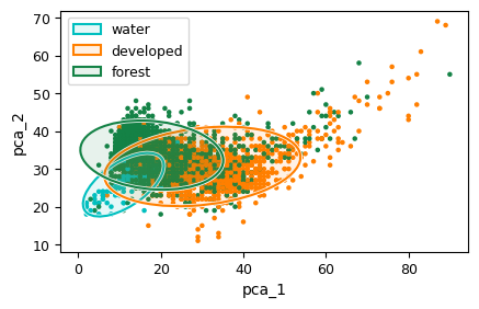 Figure 4. Scatterplot with confidence ellipses per land class. The
radius of the ellipses is 2 SD.
Figure 4. Scatterplot with confidence ellipses per land class. The
radius of the ellipses is 2 SD.
SEE ALSO
d.vect.colbp, v.histogram, r.boxplot, r.series.boxplot, t.rast.boxplot, r.scatterplot r3.scatterplot
AUTHOR
Paulo van Breugel, HAS green academy, Innovative Biomonitoring research group, Climate-robust Landscapes research group
SOURCE CODE
Available at: v.scatterplot source code
(history)
Latest change: Sunday Aug 02 19:20:49 2026 in commit 90b2b6d